Front-end/React.js
4. Sass : outline,fullWidth props 설정 - 컴포넌트 스타일링 | 벨로퍼트
AGAL
2020. 7. 13. 23:37
반응형
outline 옵션 만들기
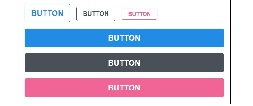
이번에는 outline 이라는 옵션을 주면 버튼에서 테두리만 보여지도록 설정을 해보겠습니다.
Button.js 를 다음과 같이 수정해보세요.
/src/components/Button.js :
function Button({ children, size, color, outline }) {
  return (
    <button className={ classNames('Button', size, color, { outline }) }>
      {children}
    </button>
  );
}
여기서는 outline 값을 props 로 받아와서 객체 안에 집어 넣은 다음에 classNames() 에 포함시켜줬는데요, 이렇게 하면 outline 값이 true 일 때에만 button 에 outline CSS 클래스가 적용됩니다.
만약 outline CSS 클래스가 있다면, 테두리만 보여지도록 스타일쪽 코드도 수정해보세요.
/src/components/Button.scss :
@mixin button-color($color) {
  background: $color;
  &:hover {
    background: lighten($color, 10%);
  }
  &:active {
    background: darken($color, 10%);
  }
  &.outline {
    color: $color;
    background: none;
    border: 1px solid $color;
    &:hover {
      background: $color;
      color: white;
    }
  }
}
button-color mixin 을 만들었었기 때문에 작업이 굉장히 간단하지요?
그럼 이제 App 에서 사용을 해봅시다.
/src/App.js :
function App() {
  return (
    <div className="App">
      // ...

      <div className="buttons">
        <Button size="large" color="blue" outline>
          BUTTON
        </Button>
        <Button color="gray" outline>
          BUTTON
        </Button>
        <Button size="small" color="pink" outline>
          BUTTON
        </Button>
      </div>
    </div>
  );
}
전체 너비 차지하는 옵션
이번에는 fullWidth 라는 옵션이 있으면 버튼이 전체 너비를 차지하도록 구현을 해보겠습니다. 구현 방식은 방금 했었던 outline과 굉장히 유사 합니다.
Button.js 를 다음과 같이 수정해주세요.
/src/components/Button.js :
function Button({ children, size, color, outline, fullWidth }) {
  return (
    <button
      className={ classNames('Button', size, color, { outline, fullWidth }) }>
      {children}
    </button>
  );
}
그 다음, 스타일도 수정해봅시다.
/src/components/Button.scss :
.Button {
  // ...

  &.fullWidth {
    width: 100%;
    justify-content: center;
    & + & {
      margin-left: 0;
      margin-top: 1rem;
    }
  }
}
App 에서 사용을 해봅시다!
/src/App.js :
function App() {
  return (
    <div className="App">
      // ...

      <div className="buttons">
        <Button size="large" fullWidth>
          BUTTON
        </Button>
        <Button size="large" fullWidth color="gray">
          BUTTON
        </Button>
        <Button size="large" fullWidth color="pink">
          BUTTON
        </Button>
      </div>
    </div>
  );
}
반응형